

sleek-design-mobile-apps
★ 437by sleekdotdesign · part of sleekdotdesign/agent-skills
Use when the user wants to design a mobile app or UI screens, when they mention their Sleek (sleek.design) projects, or when implementing Sleek designs in code (HTML, React Native, SwiftUI).
This is the playbook your agent receives when the skill activates — you don't need to read it to use the skill, but it's here to audit before installing.
Designing with Sleek
Overview
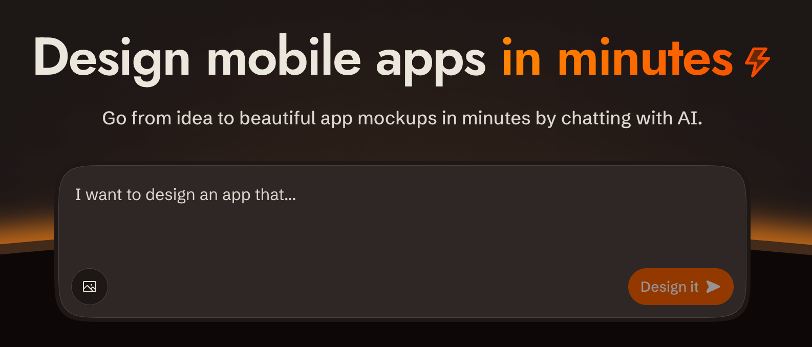
sleek.design is an AI-powered mobile app design tool. You interact with it via a REST API at /api/v1/* to create projects, describe what you want built in plain language, and get back rendered screens. All communication is standard HTTP with bearer token auth.
Base URL: https://sleek.design
Auth: Authorization: Bearer $SLEEK_API_KEY on every /api/v1/* request
Content-Type: application/json (requests and responses)
CORS: Enabled on all /api/v1/* endpoints
Parsing responses: write the body to a file (curl -o run.json) and parse the file. Don't pipe JSON through echo: in zsh it expands the escaped \n inside string values into real newlines, which makes the body invalid JSON.
API docs: OpenAPI spec at https://sleek.design/api/v1/spec.json; browsable docs at https://sleek.design/api/v1/docs. Fetch the spec for any contract detail not covered here.
Security & Privacy
- Single host: All requests go exclusively to
https://sleek.design. No data is sent to third parties. - HTTPS only: All communication uses HTTPS. The API key is transmitted only in the
Authorizationheader to Sleek endpoints. - Minimal scopes: Create API keys with only the scopes required for the task. Prefer short-lived or revocable keys.
- Image URLs: When using
imageUrlsin chat messages, those URLs are fetched by Sleek's servers. Avoid passing URLs that contain sensitive content.
Designing
The full request/response shapes for every endpoint used below are in the API reference.
1. Create a project
Create a project with POST /api/v1/projects if one doesn't exist yet. Derive a name from the request.
Each project has its own theme, style, and design system. If the user wants multiple design variations, create a separate project for each variation.
2. Send a chat message
Send the request with POST /api/v1/projects/:id/chat/messages. Sleek plans screen content and layout from your message, and will invent a visual style if you don't give it one. Don't decompose the request into screens and don't add product details the user didn't ask for; send the full intent as a single message. If the user described specific screens, include those. Sleek produces richer designs when given room to plan.
Author a style direction: write one whenever the user has given you anything to ground it in — reference images, apps they like, vibe adjectives, things to avoid — or whenever you're producing variations, one direction per variation. Pass the request through unchanged only when it's bare. A style direction is a single comprehensive paragraph, included in the message, covering mood (2–3 adjectives), color strategy (the logic, not hex codes), typography feel, layout philosophy, component style (radii, borders vs shadows, nav treatment), imagery and illustration style, and one or two distinctive details. Commit to a palette, a type direction, and an overall feel — anything that only sets a mood reads as a hint, not a direction. Be opinionated; don't hedge. Put the personality in color, type, and imagery rather than in unusual layout or navigation.
Extend what the user gave you and never contradict it. When they point at reference images or apps they like, study each one and carry what you take into the direction — Sleek only sees images passed as imageUrls, so for anything local the direction is how those references reach it. Borrow patterns, never the source's branding, content, or name.
Use a style direction or a referenceId, not both — a reference already carries a full style guide of its own.
Seed a style with a reference: Sleek curates a catalog of design references. When the user wants a specific look or asks for style options, list them with GET /api/v1/references (each has a name and previewImageUrls you can show) and pass the chosen id as referenceId on the first message to a project, so its style guide seeds the whole design.
Identify your tool: always send source, the slug of the tool making the request. The Sleek editor uses it to show the user who is designing while the run streams. Recognized values: claude-code, claude, codex, chatgpt, cursor, openclaw, grok. If your tool isn't listed, send a short kebab-case slug for it anyway (max 64 chars). Unrecognized values are fine and get a generic label.
Watch it live: runs render in the Sleek editor in real time. After sending the first message to a project, tell the user they can watch their screens being designed live in Sleek, and share the editor link: https://sleek.design/project/:projectId. Don't open a browser yourself unless the user asks.
Polling: chat messages are async by default: you get a runId and poll GET /api/v1/projects/:id/chat/runs/:runId. Start at 2s interval, back off to 5s after 10s, give up after 5 minutes. Exit on completed or failed; if you can't read the status, stop and report it rather than counting it as "not done yet". You can also use ?wait=true for a blocking call (up to 300s; falls back to polling if it times out with 202).
Editing a specific screen: use target.screenId to direct changes to the right screen. The screenId comes from the run's result.operations or from the screenId field on each component returned by GET /api/v1/projects/:id/components; it is not the component ID.
One run at a time: only one active run is allowed per project. If you get 409 CONFLICT, wait for the current run to complete before sending the next message. If the user changed their mind or a stale run is blocking the project, cancel it (see Cancel Run). Messages to different projects can run in parallel; use async polling (not ?wait=true) when running multiple projects concurrently.
Safe retries: add an idempotency-key header (≤255 chars) to replay-safe re-sends. The server returns the existing run rather than creating a duplicate.
3. Show the results
After every chat run that produces screen_created or screen_updated operations, take screenshots and show them to the user using POST /api/v1/screenshots. The step is done only when the user has seen a screenshot of every screen the run created or updated; never complete a run silently.
- New screens: one screenshot per screen + one combined screenshot of all screens in the project.
- Updated screens: one screenshot per affected screen.
Use background: "transparent" unless the user explicitly requests a specific background color.
Save screenshots in the project directory (not a temporary folder) so the user can easily view them.
Showing vs reviewing: the defaults capture only the viewport, which is the right framing for the user — screens look like phone screens. They are the wrong framing for judging your own work, because everything below the fold is cropped away. When you're reviewing what a run produced, re-shoot the screen with fullHeight: true (one screen per request) to see the whole scrollable page.
Screenshot requests are independent, so issue them in parallel — the user-facing shot and your fullHeight review shot go out together, as do the shots for different screens. "One screen per request" governs what goes into each image, not how fast you send them; it is not a reason to wait for one response before starting the next. Back off only if you actually get a 429.
Never call a screen incomplete from a viewport screenshot. Content that looks missing is almost always just below the fold. Before telling the user something is absent, or sending a follow-up message asking Sleek to add it, confirm it against the whole screen: a fullHeight: true screenshot, or the component HTML from GET /api/v1/projects/:id/components/:componentId, which is the ground truth for what's on the screen. The screenshot is the default and answers most review questions on its own — don't go to the code to double-check something it already shows. Reach for the code only when you're about to claim something is missing: a render can omit what's really there (past the height cap, in a collapsed section, on a later carousel slide), so a negative conclusion is the one worth a second source. Note the reverse too — an element present in the HTML may still not be visible to the user.
Implementing Designs
When the user wants to implement the designs in code (not just preview them), always fetch the component HTML code. Do not rely on screenshots alone.
Use GET /api/v1/projects/:id/components/:componentId to fetch each screen's code. The componentId comes from the chat run's result.operations.
Component code can be large. When saving it to files, avoid writing the content through your text output: it's slow and wastes tokens. Instead, use shell commands to fetch the API response and write it directly to disk (e.g., pipe the response body into a file).
Which version to use
Each component carries a versions[] array and an activeVersion: number. By default, use the entry where versions[i].version === activeVersion: that's the code currently shown in Sleek.
If the user's prompt pins specific versions, follow those instead (see Pinned versions below).
Pinned versions
The user's prompt may include a pin block telling you to implement specific historical versions instead of the current ones, like this:
... at this exact state instead of the project's current version:
- component cmp_abc: version ver_001
- component cmp_def: version ver_002
- theme thm_ghi: version ver_003
When you see a pin block, implement those exact versions instead of activeVersion. Components not named in the pin block continue to use their active version. Theme IDs surface only inside pin blocks; this skill exposes no separate endpoint to enumerate them.
Fetching the right code
For each pinned component, find the entry in versions[] where versions[i].id matches the given version id (e.g. ver_001) and use its code. Do not fall back to activeVersion for pinned components.
Screenshots of pinned versions
Pass componentVersionOverrides and themeVersionOverrides to POST /api/v1/screenshots:
{
  "componentIds": ["cmp_abc"],
  "projectId": "proj_xyz",
  "componentVersionOverrides": { "cmp_abc": "ver_001" },
  "themeVersionOverrides": { "thm_ghi": "ver_003" }
}
Keys are component / theme public ids; values are the corresponding versions[i].id. Entities missing from a map fall back to their active version. Include the override maps whenever the prompt specified pinned versions.
HTML prototypes
The component code is a complete HTML document. Save it directly to a .html file. No build step needed.
Native frameworks (React Native, SwiftUI, etc.)
Use both the HTML code and the screenshots together:
- HTML code is the implementation reference: it contains the exact structure, layout, styling, colors, spacing, content, image URLs, and icon names.
- Screenshots are the visual target: use them to verify your implementation matches the intended look.
The HTML tells you how to build it; the screenshot tells you what it should look like.
Icons
Sleek uses Iconify icons in the format prefix:name (e.g., solar:heart-bold, material-symbols:search-rounded, lucide:settings). The most common sets are Solar, Hugeicons, Material Symbols and MDI.
Use the exact icons from the HTML code. Do not substitute with a different icon set. Matching icons is important for design fidelity.
When implementing icons:
-
Check if the project already has an icon system that supports the same sets Sleek uses (Solar, Hugeicons, Material Symbols, MDI). If so, use it. Note:
@expo/vector-iconsdoes not support these sets, so do not use it as a substitute. -
Otherwise, fetch the SVGs from the Iconify API and embed them in the code:
GET https://api.iconify.design/{prefix}/{name}.svgExample:
https://api.iconify.design/solar/heart-bold.svgCollect all icon names from the HTML, fetch their SVGs, and save them as static assets or string constants in the codebase. For React Native / Expo, render them with
react-native-svg'sSvgXmlcomponent, which works in Expo Go with no additional native dependencies.
Fonts
The HTML includes Google Fonts via <link> tags in the <head>. Use the same fonts and weights when implementing in a native framework. Extract the font family names and weights from the <link> tags.
Navigation
The designs may include navigation elements like tab bars and headers. Update the project's navigation styling and structure to match the designs. Don't just implement the screen content while leaving the default navigation untouched.
Quick Reference: All Endpoints
| Method | Path | Scope | Description |
|---|---|---|---|
GET | /api/v1/projects | projects:read | List projects |
POST | /api/v1/projects | projects:write | Create project |
GET | /api/v1/projects/:id | projects:read | Get project |
DELETE | /api/v1/projects/:id | projects:write | Delete project |
GET | /api/v1/projects/:id/components | components:read | List components |
GET | /api/v1/projects/:id/components/:componentId | components:read | Get component |
GET | /api/v1/references | any valid key | List references |
POST | /api/v1/projects/:id/chat/messages | chats:write | Send chat message |
GET | /api/v1/projects/:id/chat/runs/:runId | chats:read | Poll run status |
POST | /api/v1/projects/:id/chat/runs/:runId/cancel | chats:write | Cancel run |
POST | /api/v1/screenshots | screenshots | Render screenshot |
Endpoints
Projects
List projects
GET /api/v1/projects?limit=50&offset=0
Authorization: Bearer $SLEEK_API_KEY
Response 200:
{
  "data": [
    {
      "id": "proj_abc",
      "name": "My App",
      "slug": "my-app",
      "createdAt": "2026-01-01T00:00:00Z",
      "updatedAt": "..."
    }
  ],
  "pagination": { "total": 12, "limit": 50, "offset": 0 }
}
Create project
POST /api/v1/projects
Authorization: Bearer $SLEEK_API_KEY
Content-Type: application/json

{ "name": "My New App" }
Response 201: same shape as a single project.
Get / Delete project
GET    /api/v1/projects/:projectId
DELETE /api/v1/projects/:projectId   → 204 No Content
Components
List components
GET /api/v1/projects/:projectId/components?limit=50&offset=0
Authorization: Bearer $SLEEK_API_KEY
Both list and get accept an optional inlineIcons query param (default false). When omitted, icons render as <iconify-icon> web components and the HTML pulls in the Iconify script, so leave it off by default. Pass ?inlineIcons=true only when the consumer needs self-contained SVGs in the HTML (for example, importing into tools that don't run scripts).
Response 200:
{
  "data": [
    {
      "id": "cmp_xyz",
      "screenId": "scr_xyz",
      "name": "Hero Section",
      "activeVersion": 3,
      "versions": [
        {
          "id": "ver_001",
          "version": 1,
          "code": "<!DOCTYPE html>...</html>",
          "createdAt": "..."
        }
      ],
      "createdAt": "...",
      "updatedAt": "..."
    }
  ],
  "pagination": { "total": 5, "limit": 50, "offset": 0 }
}
Get component
Fetches a single component by ID. Use this when you need the code for a specific screen (e.g., after a chat run returns a componentId in its operations).
GET /api/v1/projects/:projectId/components/:componentId
Authorization: Bearer $SLEEK_API_KEY
Response 200: { "data": ... } with a single component in the same shape as a list item.
References
References are curated design styles from featured Sleek projects. They are world-readable: any valid API key can list them, no scope needed.
GET /api/v1/references?limit=50&offset=0
Authorization: Bearer $SLEEK_API_KEY
Response 200:
{
  "data": [
    {
      "id": "proj_ref1",
      "name": "Ember Fitness",
      "previewImageUrls": ["https://.../screenshot.png"]
    }
  ],
  "pagination": { "total": 44, "limit": 50, "offset": 0 }
}
To use one, pass its id as referenceId on Send Message.
Chat: Send Message
This is the core action: describe what you want in message.text and the AI creates or modifies screens.
POST /api/v1/projects/:projectId/chat/messages?wait=false
Authorization: Bearer $SLEEK_API_KEY
Content-Type: application/json
idempotency-key: <optional, max 255 chars>

{
  "message": { "text": "Add a pricing section with three tiers" },
  "source": "claude-code",
  "imageUrls": ["https://example.com/ref.png"],
  "target": { "screenId": "scr_abc" },
  "referenceId": "proj_ref1"
}| Field | Required | Notes |
|---|---|---|
message.text | Yes | 1+ chars, trimmed |
source | Treat as required | Slug of the tool sending the request (see step 2 of Designing) |
imageUrls | No | HTTPS URLs only; included as visual context |
target.screenId | No | Edit a specific screen using its screenId (from run operations or the components list; not componentId); omit to let AI decide |
referenceId | No | Seed the design style from a reference (see References); invalid id → 400 |
?wait=true/false | No | Sync wait mode (default: false) |
idempotency-key header | No | Replay-safe re-sends |
Response: async (default, wait=false)
Status 202 Accepted. result and error are absent until the run reaches a terminal state.
{
  "data": {
    "runId": "run_111",
    "status": "queued",
    "statusUrl": "/api/v1/projects/proj_abc/chat/runs/run_111"
  }
}
Response: sync (wait=true)
Blocks up to 300 seconds. Returns 200 when completed, 202 if timed out.
{
  "data": {
    "runId": "run_111",
    "status": "completed",
    "statusUrl": "...",
    "result": {
      "assistantText": "I added a pricing section with...",
      "operations": [
        {
          "type": "screen_created",
          "screenId": "scr_xyz",
          "screenName": "Pricing",
          "componentId": "cmp_xyz"
        },
        {
          "type": "screen_updated",
          "screenId": "scr_abc",
          "componentId": "cmp_abc"
        },
        { "type": "theme_updated" }
      ]
    }
  }
}
Chat: Poll Run Status
Use this after async send to check progress.
GET /api/v1/projects/:projectId/chat/runs/:runId
Authorization: Bearer $SLEEK_API_KEY
The response has the same data shape as send message: result is present when completed, error when failed:
{
  "data": {
    "runId": "run_111",
    "status": "failed",
    "statusUrl": "...",
    "error": { "code": "execution_failed", "message": "..." }
  }
}
Run status lifecycle: queued → running → completed | failed
Chat: Cancel Run
POST /api/v1/projects/:projectId/chat/runs/:runId/cancel
Authorization: Bearer $SLEEK_API_KEY
Marks a queued or running run as failed with error code cancelled and returns the updated run; already-finished runs are returned unchanged. Use it when the user changes their mind mid-run or a stale run is blocking the project with 409 CONFLICT.
Screenshots
Takes a snapshot of one or more rendered components.
POST /api/v1/screenshots
Authorization: Bearer $SLEEK_API_KEY
Content-Type: application/json

{
  "componentIds": ["cmp_xyz", "cmp_abc"],
  "projectId": "proj_abc",
  "format": "png",
  "scale": 2,
  "gap": 40,
  "padding": 40,
  "background": "transparent"
}| Field | Default | Notes |
|---|---|---|
format | png | png or webp |
scale | 2 | 1–3 (device pixel ratio) |
gap | 40 | Pixels between components |
padding | 40 | Uniform padding on all sides |
paddingX | (optional) | Horizontal padding; overrides padding for left/right when provided |
paddingY | (optional) | Vertical padding; overrides padding for top/bottom when provided |
paddingTop | (optional) | Top padding; overrides paddingY when provided |
paddingRight | (optional) | Right padding; overrides paddingX when provided |
paddingBottom | (optional) | Bottom padding; overrides paddingY when provided |
paddingLeft | (optional) | Left padding; overrides paddingX when provided |
background | transparent | Any CSS color (hex, named, transparent) |
showDots | false | Overlay a subtle dot grid on the background |
fullHeight | false | Capture the entire scrollable screen instead of just the viewport (see below) |
radius | 48 | Squircle corner radius per component in pixels (integer ≥ 0); pass 0 for sharp corners |
componentVersionOverrides | (optional) | Map of componentId → versions[i].id to render at a pinned version instead of activeVersion (see Pinned versions) |
themeVersionOverrides | (optional) | Map of themeId → versions[i].id to render with a pinned theme version (see Pinned versions) |
Padding resolves with a cascade: per-side → axis → uniform. For example, paddingTop falls back to paddingY, which falls back to padding. So { "padding": 20, "paddingX": 10, "paddingLeft": 5 } gives top/bottom 20px, right 10px, left 5px.
By default a component is captured at frame height, so anything the user would reach by scrolling is cut off. fullHeight: true expands each frame to the height of its own content before capturing. Use it when you're reviewing your own work; leave it off for the screenshots you show the user, where the phone-shaped framing is the point.
Frames are capped at 4× the default frame height, so a screen longer than that is still cut off at the bottom even with fullHeight: true. On a very long screen, treat the component HTML as the authority for what's below the cap. Expanded frames make for tall images; prefer one component per request so each screen keeps its detail — and send those requests in parallel rather than one after another.
When showDots is true, a dot pattern is drawn over the background color. The dots automatically adapt to the background: dark backgrounds get light dots, light backgrounds get dark dots. This has no effect when background is "transparent".
Response: raw binary image/png or image/webp with Content-Disposition: attachment.
Error Shapes
{ "code": "UNAUTHORIZED", "message": "..." }| HTTP | Code | When |
|---|---|---|
| 401 | UNAUTHORIZED | Missing/invalid/expired API key |
| 403 | FORBIDDEN | Valid key, wrong scope or plan |
| 404 | NOT_FOUND | Resource doesn't exist |
| 400 | BAD_REQUEST | Validation failure |
| 409 | CONFLICT | Another run is active for this project |
| 429 | TOO_MANY_REQUESTS | Too many requests; back off and retry later |
| 500 | INTERNAL_SERVER_ERROR | Server error |
401, 403, and 429 bodies may include data.url: a page where the user can fix the condition (create a key, upgrade the plan). When present, share that URL with the user instead of improvising one.
Chat run-level errors (inside data.error):
| Code | Meaning |
|---|---|
out_of_credits | Organization has no credits left |
execution_failed | AI execution error |
cancelled | Run cancelled via the cancel endpoint |
An out_of_credits error includes error.url, the page where the user can top up credits. Relay it to the user; don't retry the run until they have.
Pagination
All list endpoints accept limit (1–100, default 50) and offset (≥0). The response always includes pagination.total so you can page through all results.
GET /api/v1/projects?limit=10&offset=20npx skills add sleekdotdesign/agent-skills --skill "sleek-design-mobile-apps" --full-depthRun this in your project — your agent picks the skill up automatically.
Prerequisites: API Key
If SLEEK_API_KEY is not set, use the device flow so the user never handles the raw key:
POST https://sleek.design/api/v1/device/start(no auth) with body{"source": "your-tool-slug"}. The response contains averificationUrl, a human-checkableuserCode, a secretdeviceCode, and a pollintervalin seconds.- Show the user the
verificationUrland theuserCode, and tell them to confirm the code matches before approving. - Poll
POST https://sleek.design/api/v1/device/pollwith{"deviceCode": "..."}everyintervalseconds. When the user approves, the poll returns{"status": "approved", "key": "sk_..."}exactly once: store it asSLEEK_API_KEY. Codes expire after 15 minutes; onexpired, start over.
Fallback: send the user to https://sleek.design/agents/setup, which handles sign-in, plan upgrade, and key creation in one place, and ask them to paste the key back to you. Keys can also be managed at https://sleek.design/dashboard/api-keys. The full key value is shown only once at creation.
Plans: free accounts can try the API with their one-time trial credits (about one design run), so a new user can see their first design before any payment decision. Sustained use requires the Pro plan or higher ($49.99/month, or $30/month billed yearly at $360/year; includes 20,000 monthly AI credits, roughly 650 screens). When cost becomes relevant (the user asks, an upgrade is needed to continue, or you're about to send them to a payment page), state this pricing plainly, including the yearly option. Never let a payment step come as a surprise.
Key scopes
| Scope | What it unlocks |
|---|---|
projects:read | List / get projects |
projects:write | Create / delete projects |
components:read | List components in a project |
chats:read | Get chat run status |
chats:write | Send chat messages |
screenshots | Render component screenshots |
Create a key with only the scopes needed for the task.
Common Mistakes
| Mistake | Fix |
|---|---|
Omitting source on chat messages | Always send source so the run is attributed in the Sleek editor |
Using wait=true on long generations | It blocks 300s max; have a fallback to polling for 202 response |
Assuming result is present on 202 | result is absent until status is completed |
Piping a JSON response through echo to parse it | zsh expands the \n in assistantText and breaks the JSON; parse from a file instead |
| Treating an unreadable run status as "not done yet" | The loop then spins to its cap long after the run finished; stop and report instead |
| Calling a screen incomplete based on a viewport screenshot | The content is usually below the fold; re-shoot with fullHeight: true or check the component HTML before reporting anything missing |
Using screenId as componentIds in screenshots | screenId and componentId are different: every screen has both (run operations and the components list return the pair). the chat message target.screenId takes screenId; screenshots and component reads take componentId |
Confusing versions[i].version (number) with versions[i].id (string) | When resolving pinned versions, match by id (e.g. ver_001); version is the numeric index |
Licensed under MIT— you can use, modify, and redistribute it under that license's terms.
View the full license file on GitHub →